Product design · SaaS marketplace
Three kinds of customer, one front door.
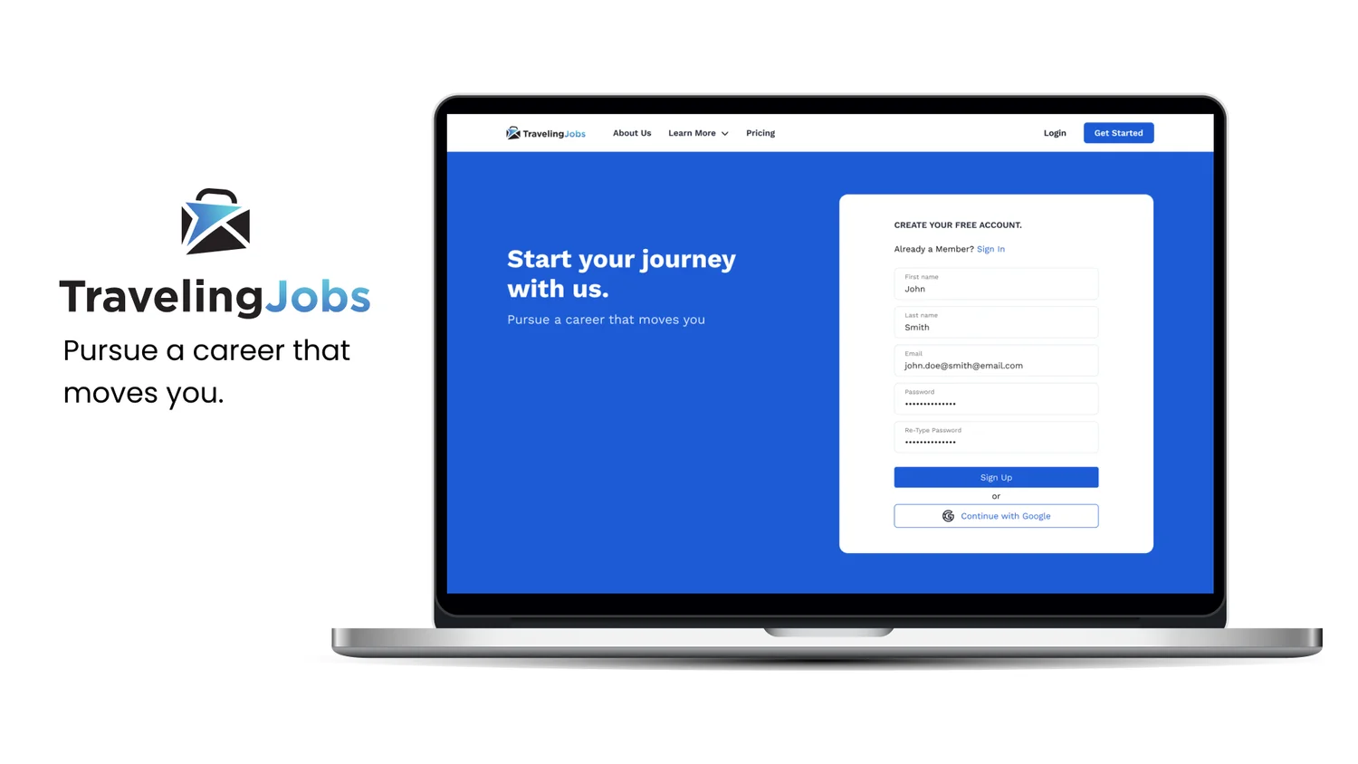
Traveling nurses need a contract and somewhere to sleep near it. Facilities need staff; landlords need tenants. I designed the platform that puts all three in one place — for Blue Umbrella Software, as their product designer.
- Role
- Product designer — research, personas, journey and user flows, wireframes, style guide, high-fidelity screens
- Client
- Blue Umbrella Software · travelingjobs.com
- Duration
- August 2022 – February 2023
- Users
- Traveling nurses, healthcare facilities and HR reps, landlords and property owners
- Tools
- Figma
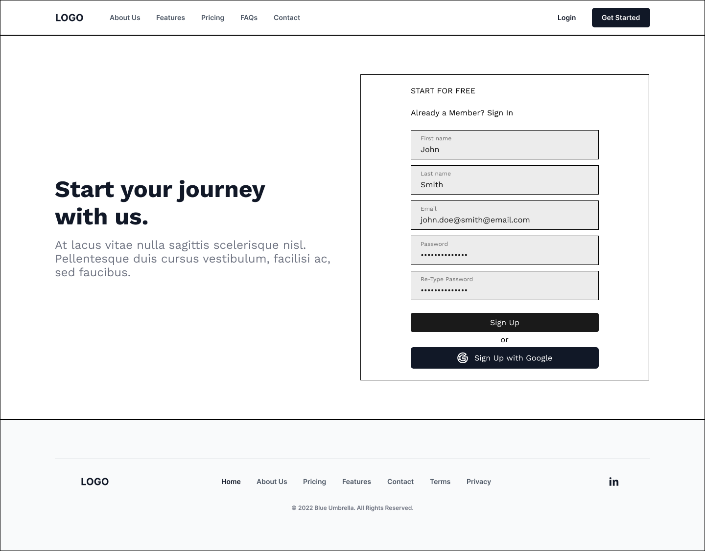
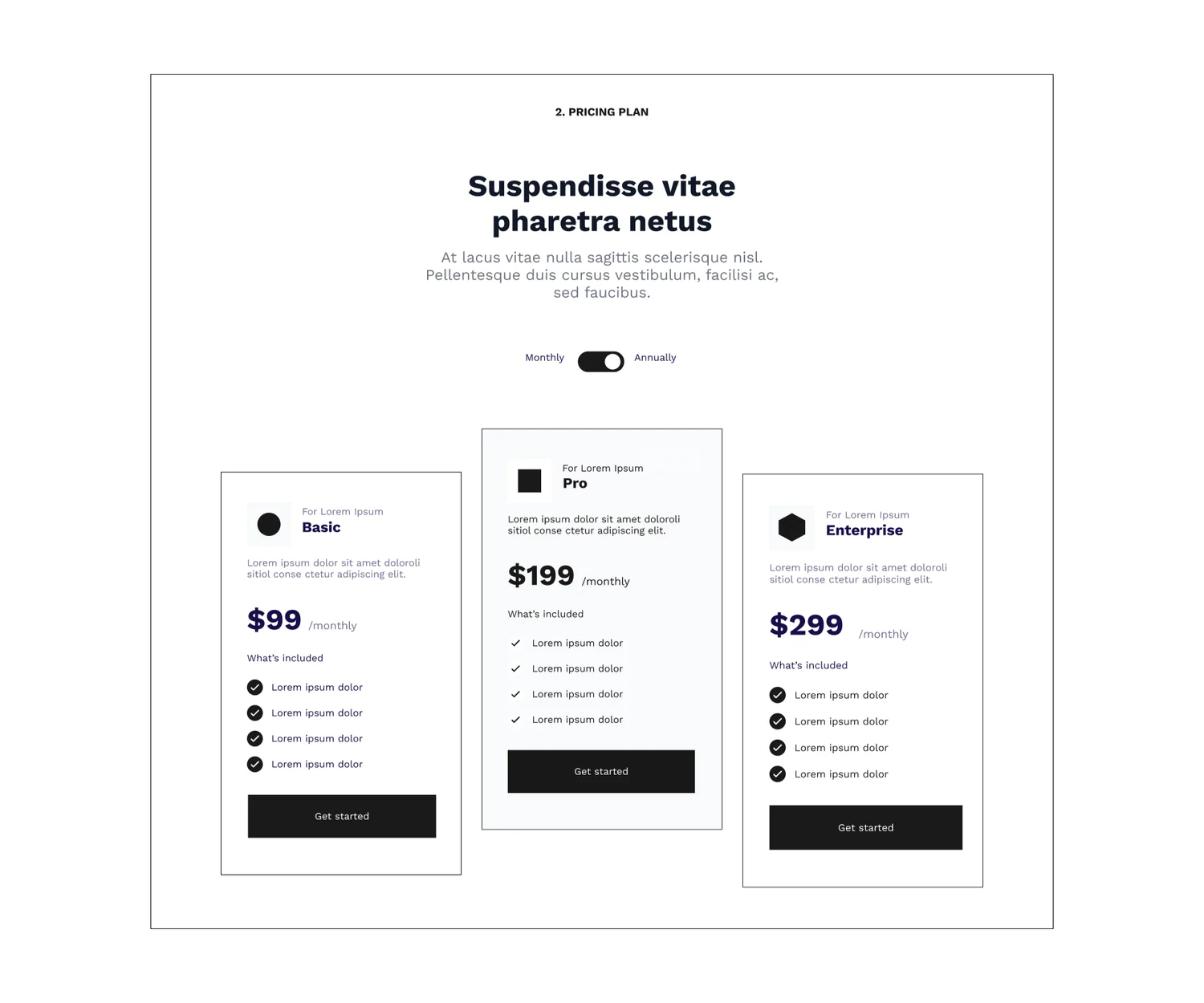
Earlier work, written up from the original project files. Some high-fidelity screens still carry placeholder copy where the client's final copy wasn't in yet; they are shown as they were.
2020 made travel nursing ordinary. The tools didn't follow.
Working on the road isn't new. But in 2020, while most office work went remote, medical staff went the other way — crossing state lines, sometimes the country, to cover shortages. A nurse taking a contract away from home has two problems at once: the job, and somewhere to live near it.
Those two problems usually live on different sites, run by people who don't talk to each other. The brief was a single platform where travelers find and book roles and housing, and where the people offering both — facilities, HR reps and property owners — can list them.
So the design problem was a three-sided marketplace: every screen had to know who was looking at it.
What a traveler is actually worried about.
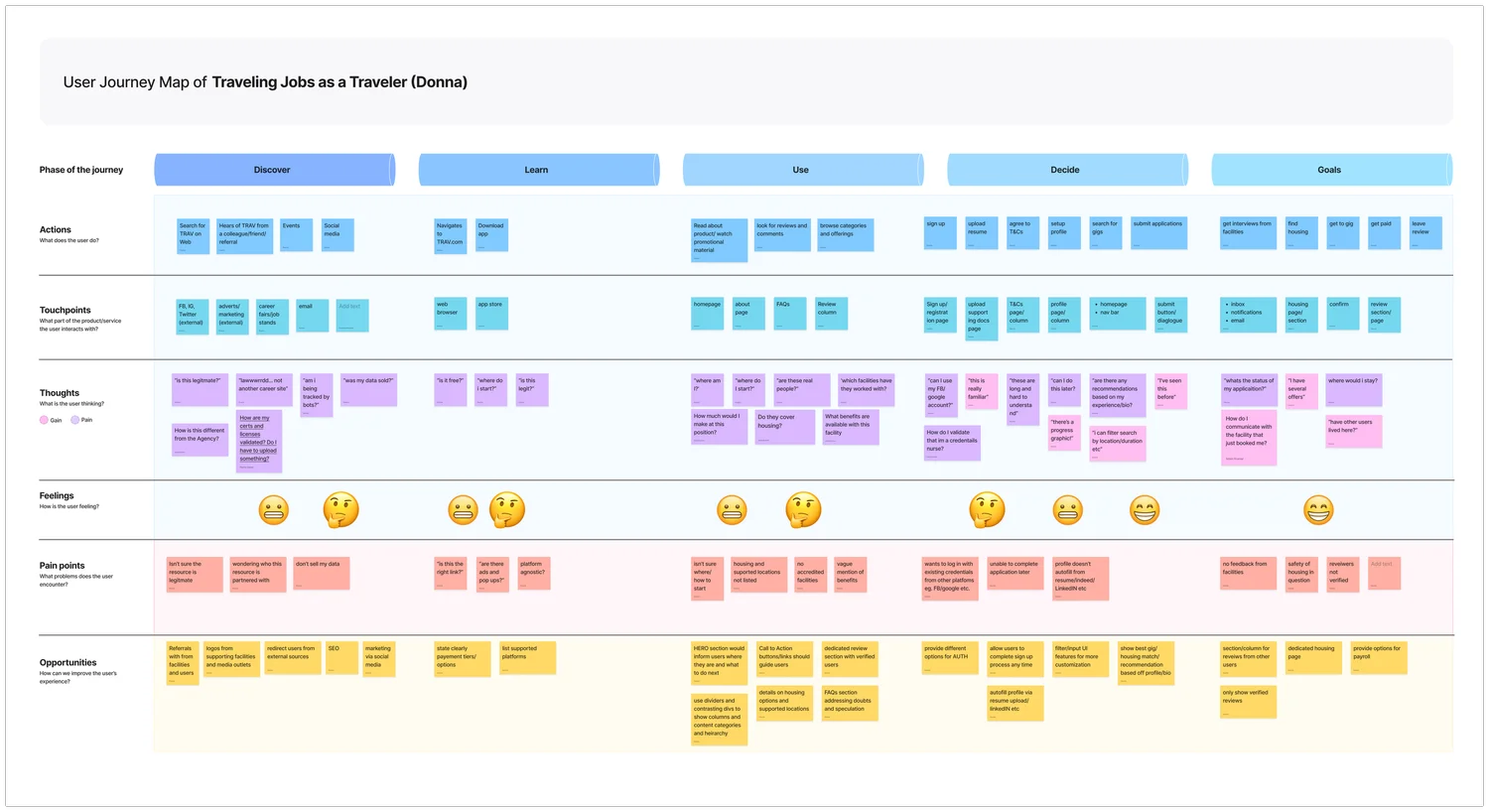
I ran interviews and built empathy maps, then a persona per side of the market. The traveler persona, Donna, is a 26-year-old registered nurse from Pittsburgh, open to relocating for a stretch. What she wants is plain: roles filtered by duration and housing, a commute she can live with, fair and transparent offers. What gets in her way is trust — reviews of roles she can't verify, the feeling of being haggled, housing she can't vouch for.
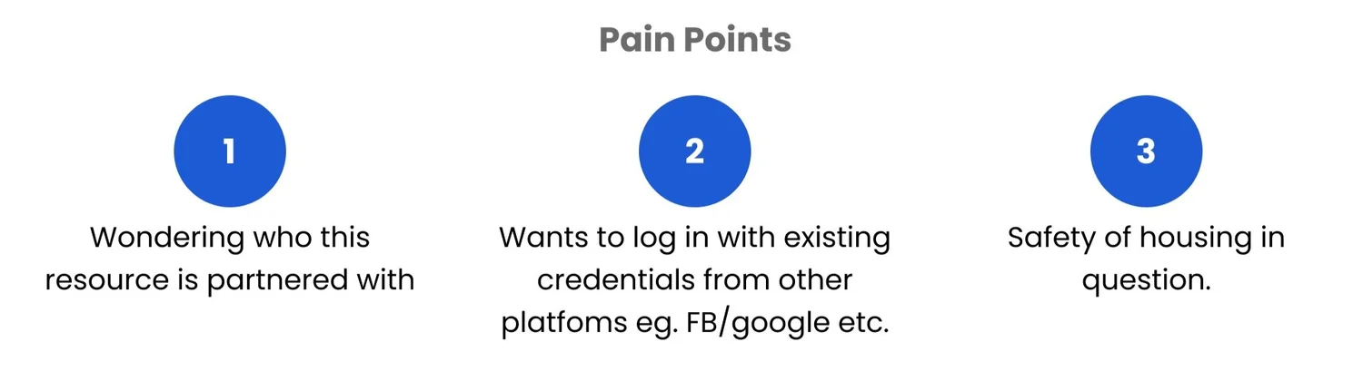
- Pain point 1
- Who is this resource partnered with? A traveler needs to know who stands behind a listing before handing over details.
- Pain point 2
- Another login. Travelers wanted to sign in with accounts they already had — Google, Facebook.
- Pain point 3
- Is the housing safe? Short-term housing from people they'd never met came up again and again.

Four calls the research made for me.
- Ask who you are first
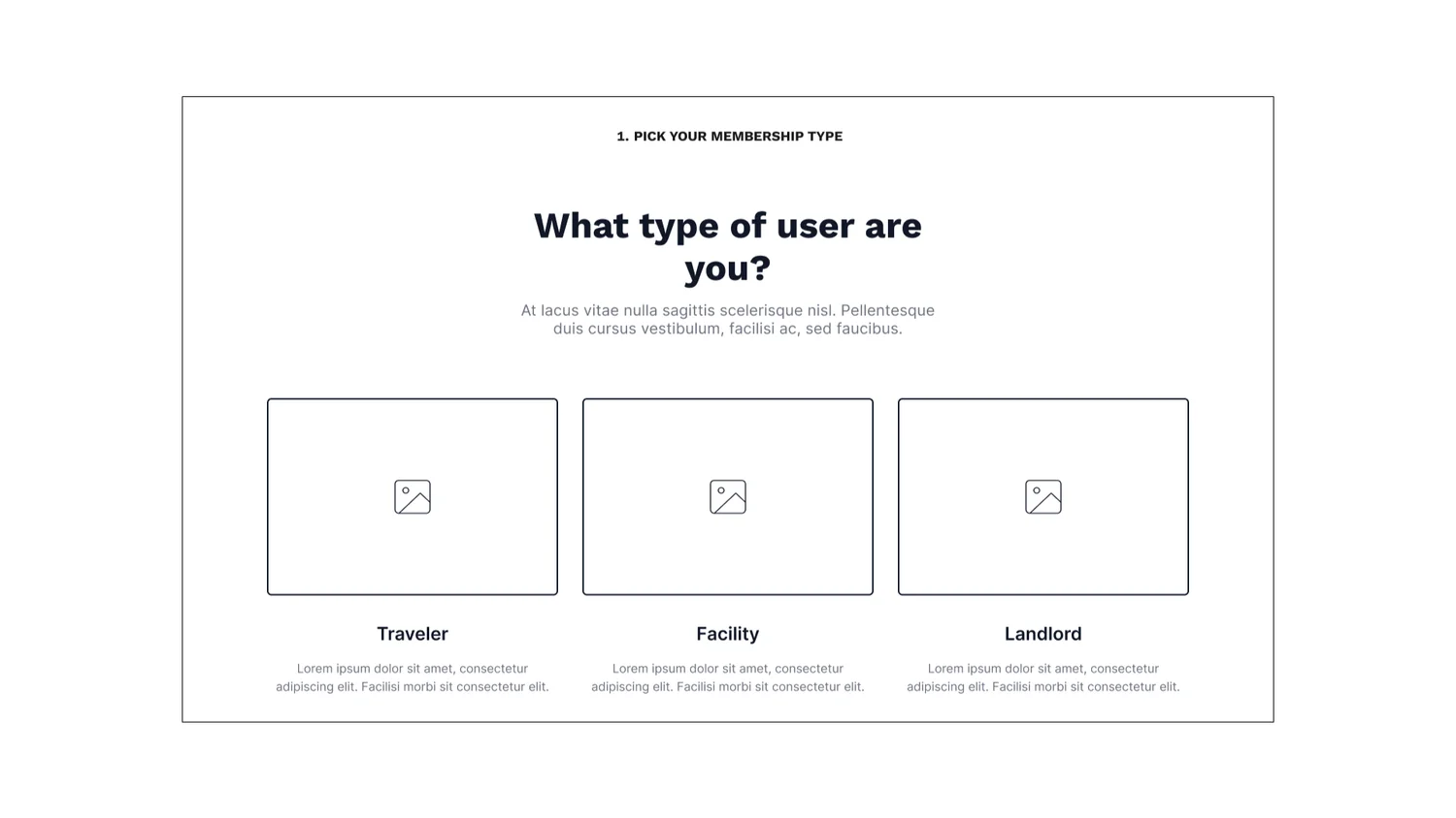
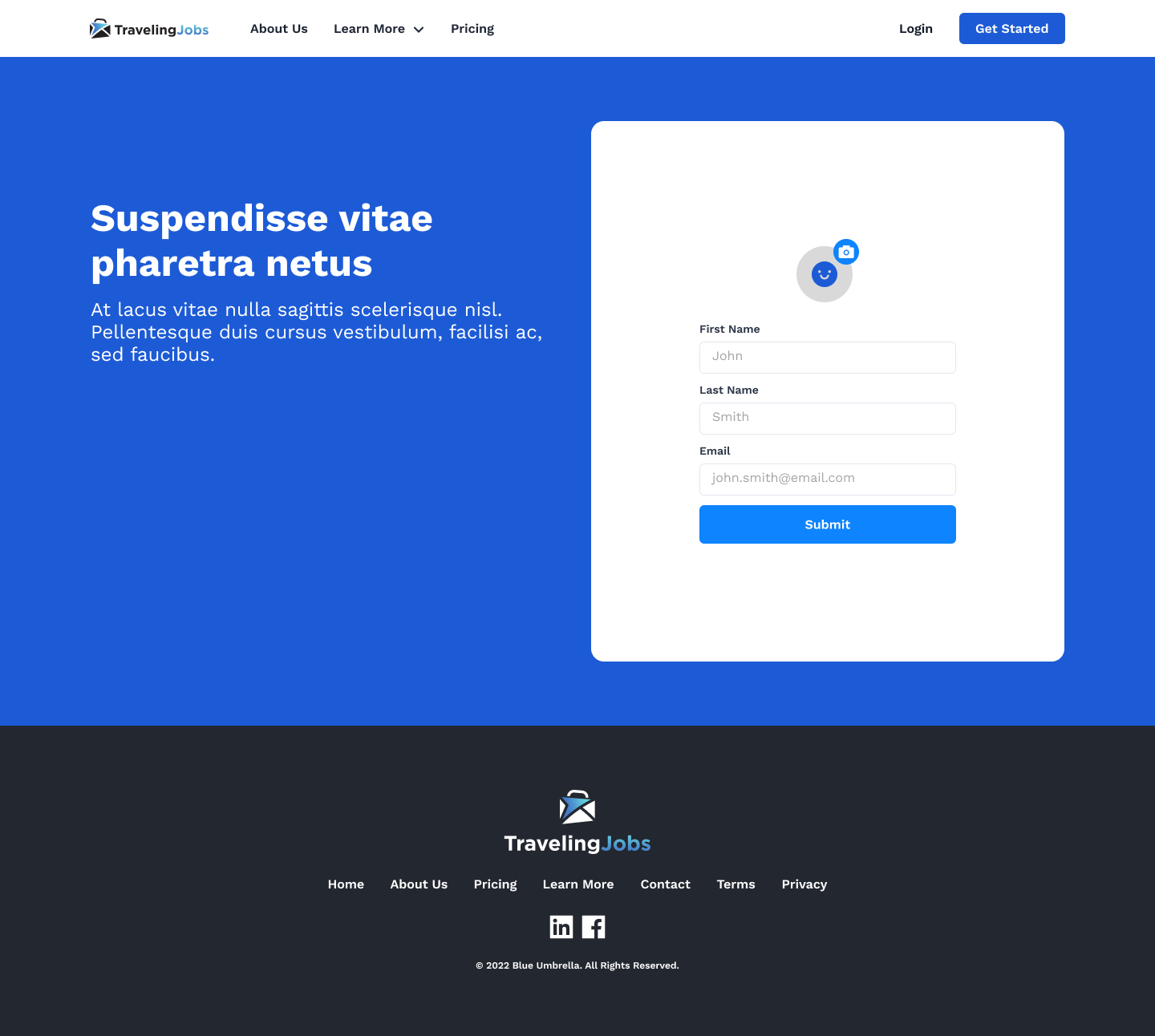
- The first screen after sign-up asks for a user type — Traveler, Facility or Landlord — and everything after it branches. Three audiences sharing one undifferentiated flow is how a marketplace ends up serving none of them.
- Sign in with what you have
- Google sign-in sits on the first screen and in the flow, straight from pain point two. The flow also carries the failure paths — sign-in failed, forgot password, reset — rather than leaving them to the build.
- Status works like LinkedIn
- In stakeholder review, comments on the persona questioned a single “status” field: for a traveler it should describe the job hunt — open to work, not looking, on a contract now — while a facility's status is a different thing entirely. That reframed the field from a generic profile attribute into the traveler's job-hunt state.
- Answer the trust questions out loud
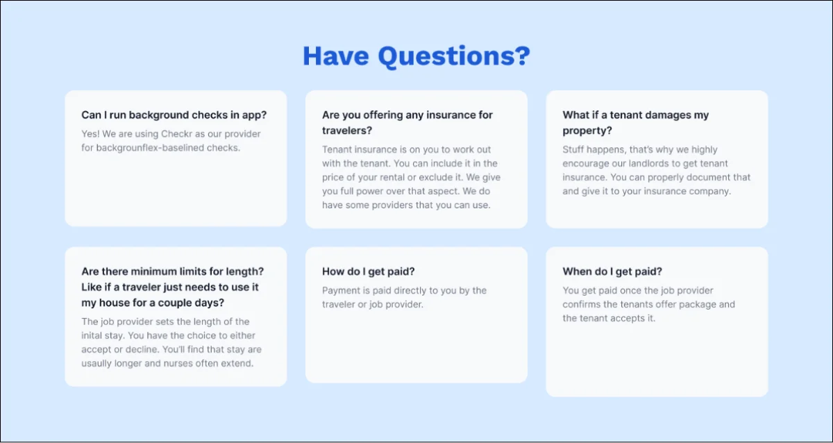
- The landlord and traveler pages carry an FAQ built from the safety worries in research: background checks run in-app through Checkr, who handles tenant insurance, what happens if a property is damaged, how and when owners get paid.

Built on the brand that already existed.
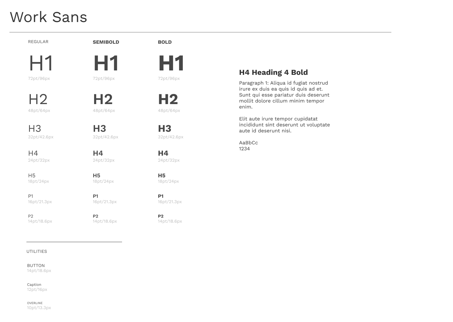
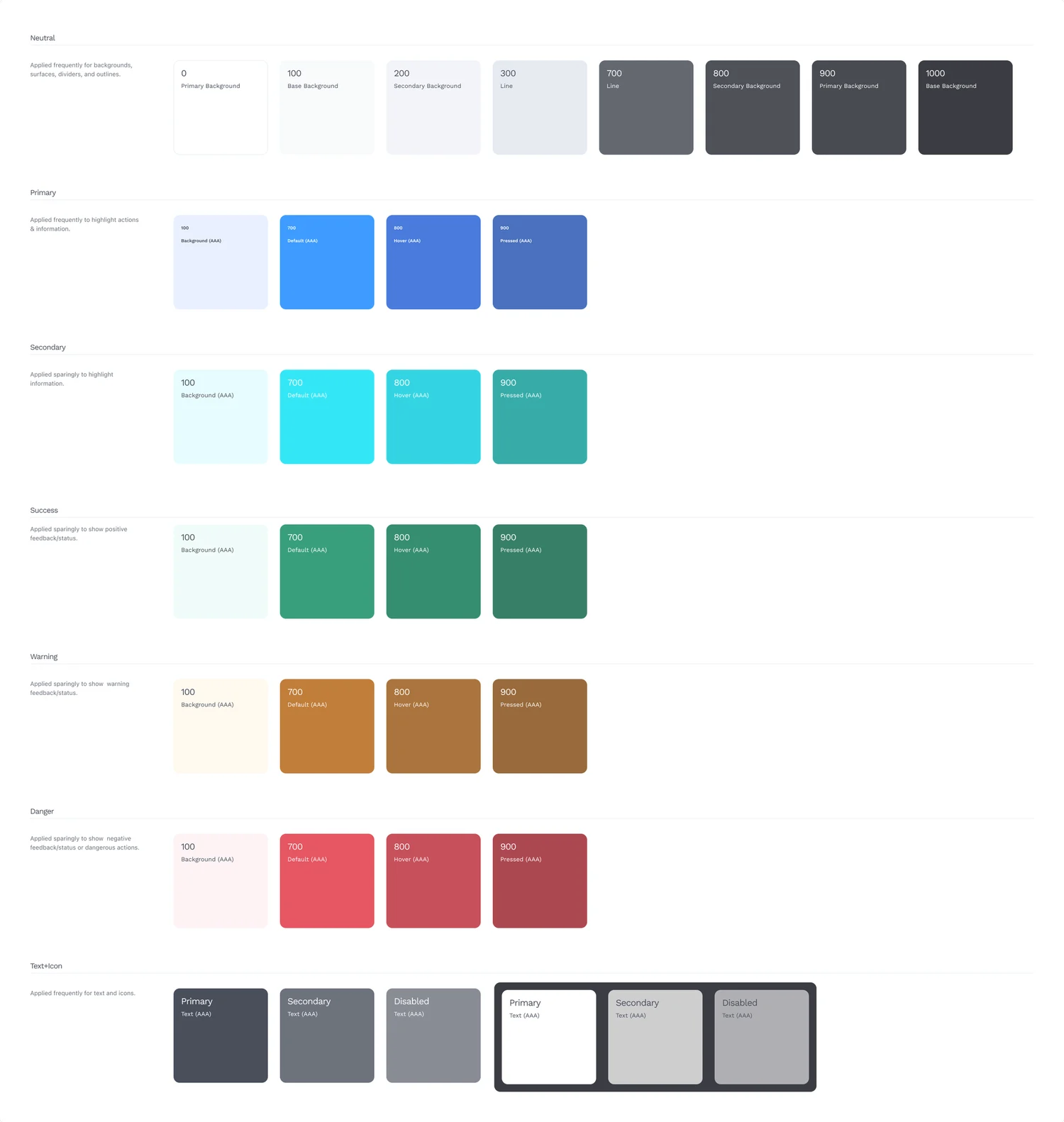
Traveling Jobs had a mark and a blue already, so the style guide extends rather than replaces them: Work Sans in three weights for the type scale, and a palette of the brand blues with neutral, teal, green, amber and red ramps for states and accents.
The screens, side by side.
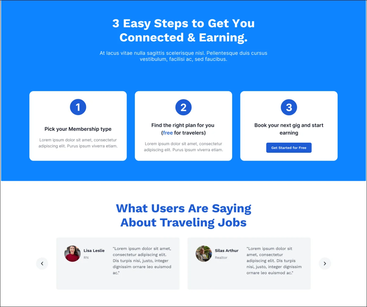
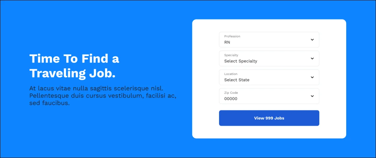
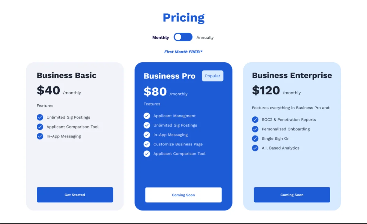
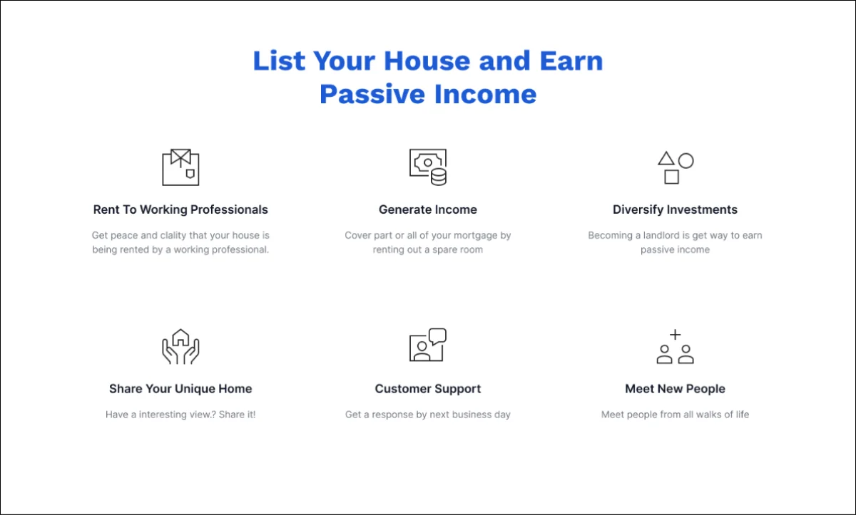
Each audience gets its own landing page with its own job to do: travelers search by profession, specialty and location; facilities choose a plan; landlords learn how to list a home and get paid.
Honest next steps.
- Test
- None of this has been through a usability round yet. Five sessions per side of the market — the user-type fork first, because every later screen depends on people choosing correctly there.
- Finish
- Replace the remaining placeholder copy with the client's, then re-check the pages for length; real copy is longer than lorem ipsum and the cards were sized to the latter.
- Measure
- Completion of sign-up by user type, and how many travelers book housing and a role together — the whole bet of the product is that those happen in one place.
An ongoing engagement: I'm still in regular contact with Blue Umbrella and the product is still moving.