UX design and research · News platform
Everything, all at once, is the same as nothing.
GhanaWeb loads the whole of Ghanaian news on every visit. I redesigned it around one idea — the reader decides what the front page is — as sole designer and researcher, during my master's at Ohio University.
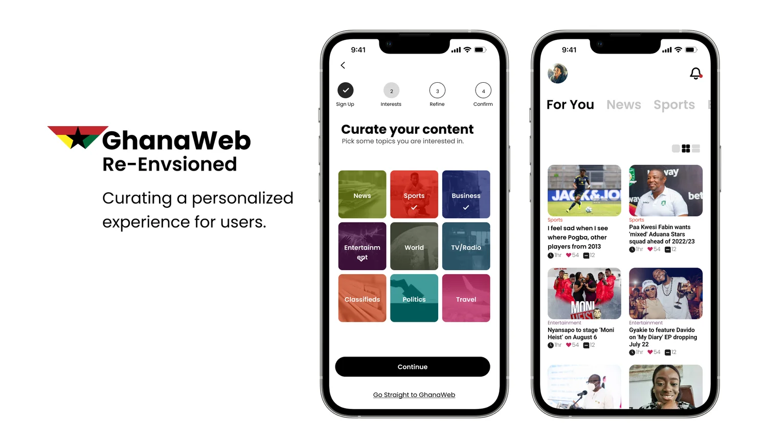
- Role
- Sole UX designer and researcher — interviews, persona, flows, sketches, wireframes, style guide, prototype
- Context
- M.A., Infographics and Interactive Media Design, Ohio University
- Duration
- November 2018 – May 2019, revisited since
- Platform
- ghanaweb.com · mobile first
- Tools
- Paper, Figma
Academic project, not commissioned by GhanaWeb. The redesign is mine; the brand, and the news content in the mocks, are GhanaWeb's.
A front page that can't tell you apart from anyone else.
GhanaWeb is a go-to source for news from Ghana. Open it and the whole site arrives at once — politics, sport, entertainment, business, gossip — in the same order for everybody. Readers described being overwhelmed by the volume and variety before they'd found the one thing they came for.
The brief I set: let readers curate the feed by parameters they choose, and keep the rest of GhanaWeb one tap away.
Paul wants the transfer news. That's it.
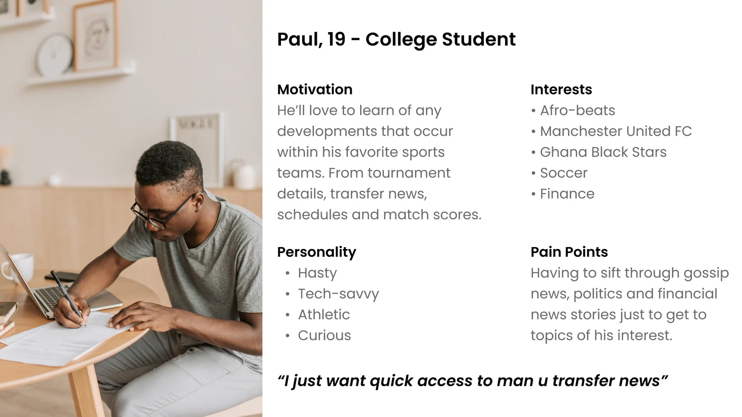
Interviews and empathy maps gave a user group from teens to millennials. The persona that crystallized it is Paul, 19, a college student who follows Manchester United, the Black Stars and Afrobeats, and has a passing interest in finance. His quote became the test for every screen: “I just want quick access to Man U transfer news.”
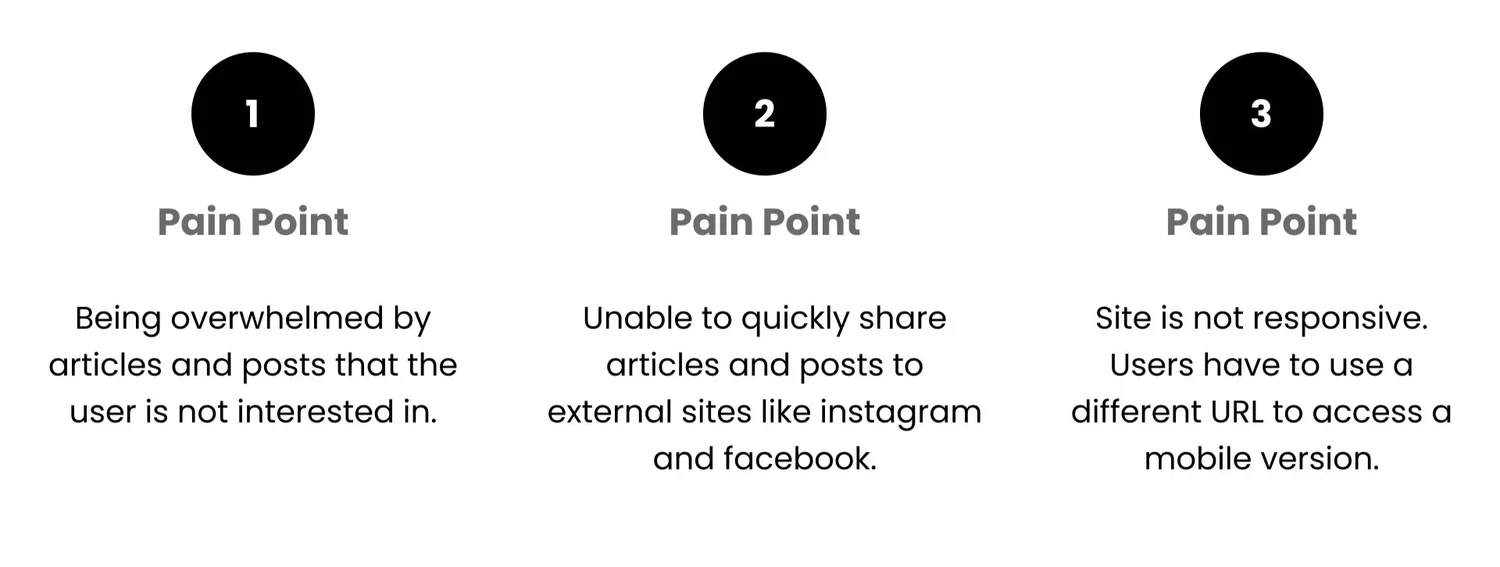
- Pain point 1
- Overwhelmed by articles and posts the reader has no interest in.
- Pain point 2
- No quick way to share an article out to Instagram or Facebook, which is where the conversation actually happens.
- Pain point 3
- The site isn't responsive — phone readers are sent to a different URL for a separate mobile version.
Curation is a four-step flow, not a settings page.
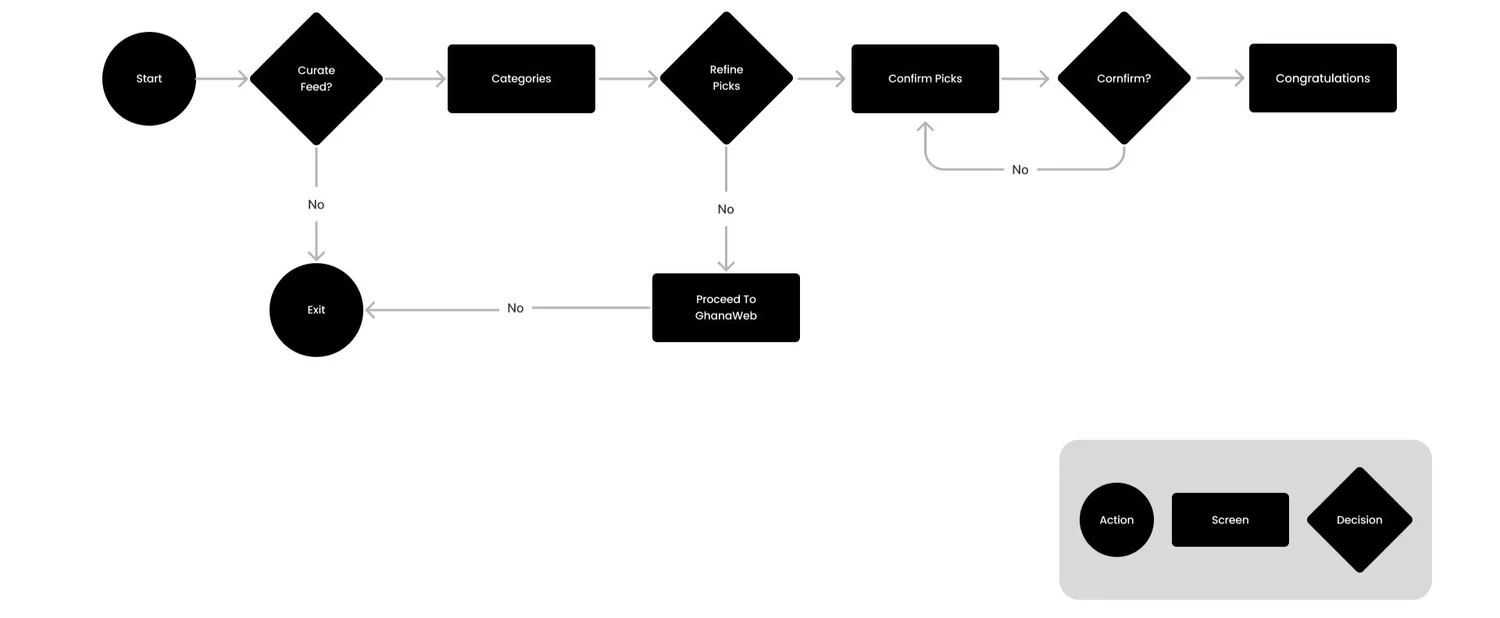
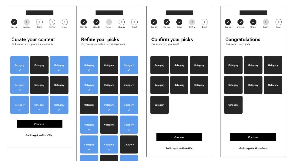
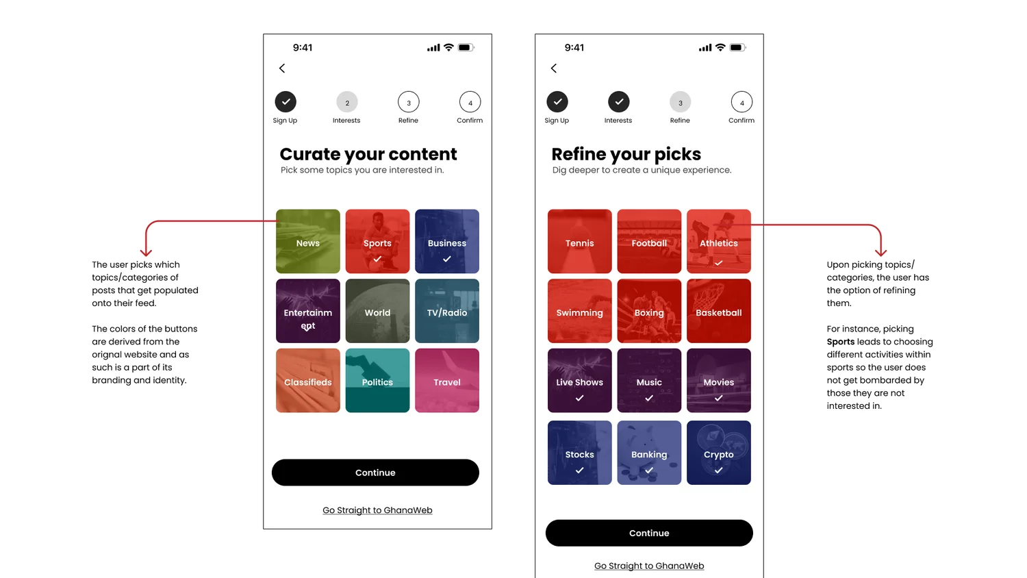
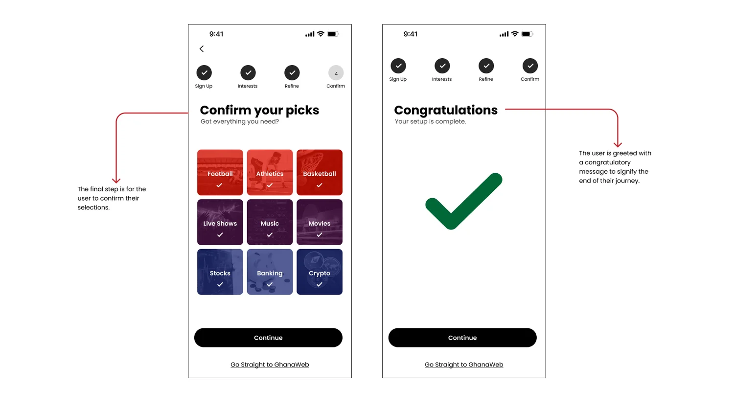
Personalization usually hides in settings, where nobody goes. Here it is onboarding: sign up, then curate — pick broad categories, refine them into specific picks, confirm, done. A progress indicator across the top tells you how far you are, and “Go straight to GhanaWeb” is always available for anyone who'd rather skip it.
The flows came first, then paper: rough ideation, then screen-by-screen sketches of the feed, the article and the curation steps, before anything went into Figma.

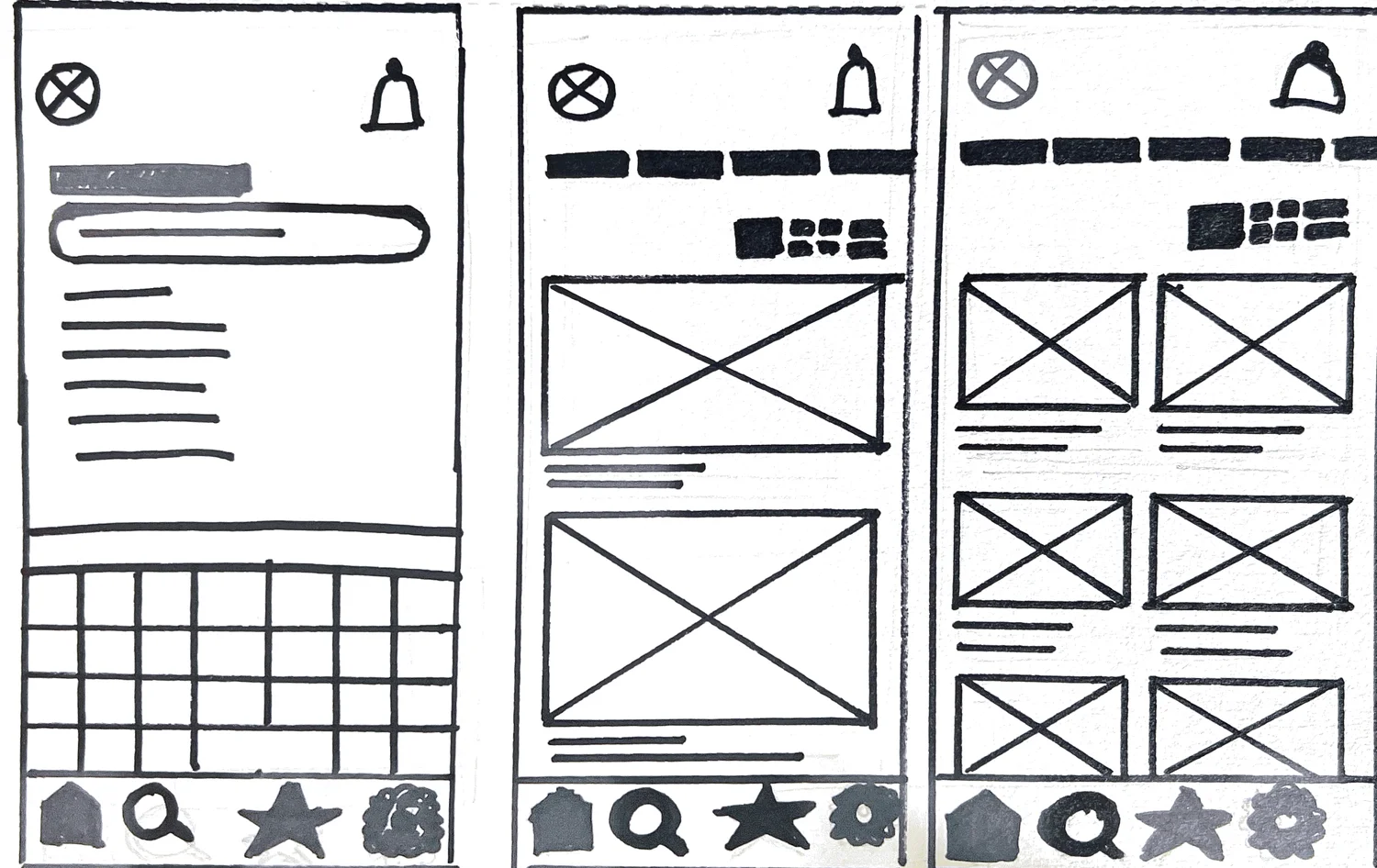
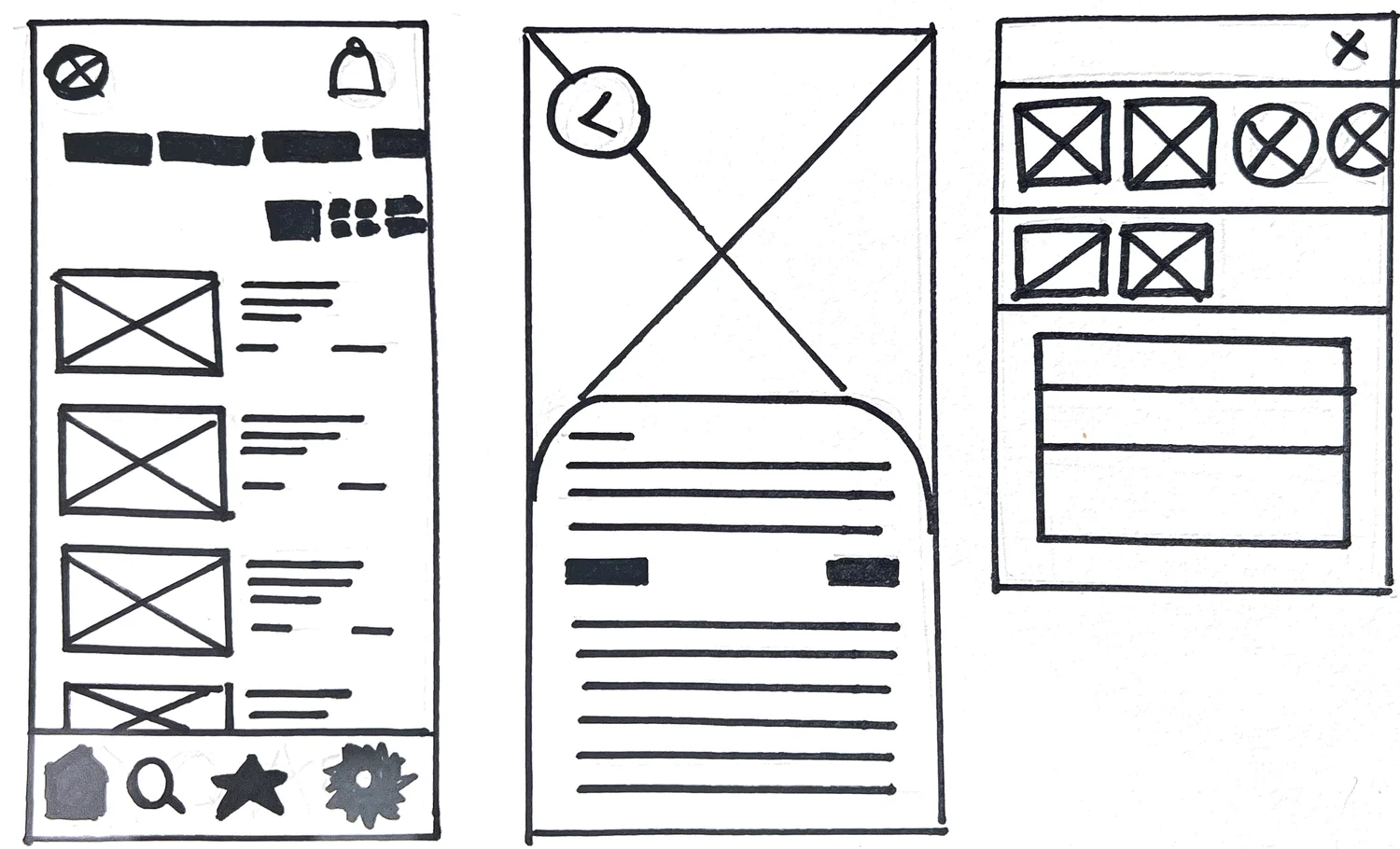
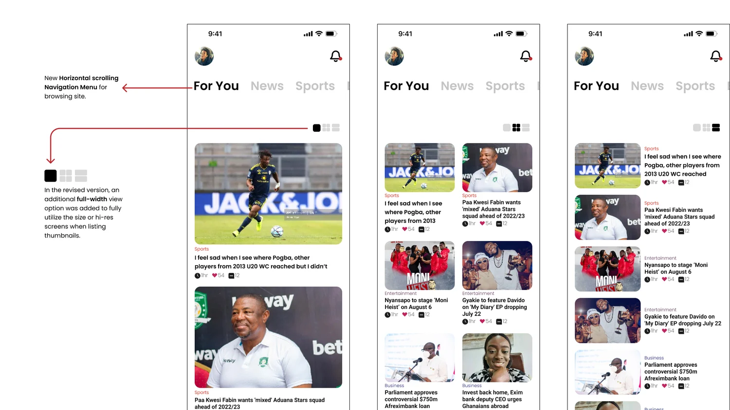
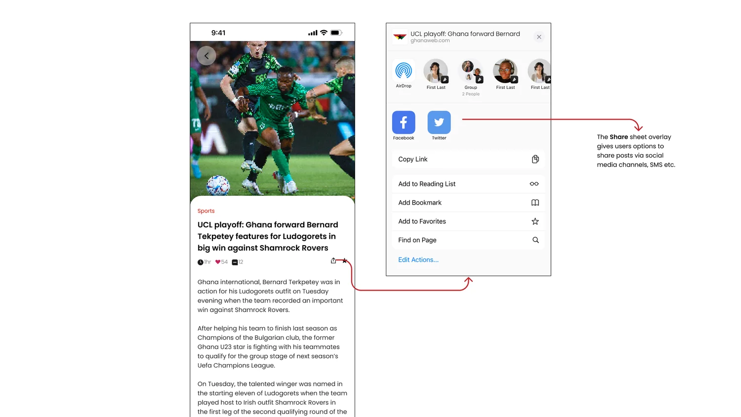
The feed, the picker, and the share sheet.
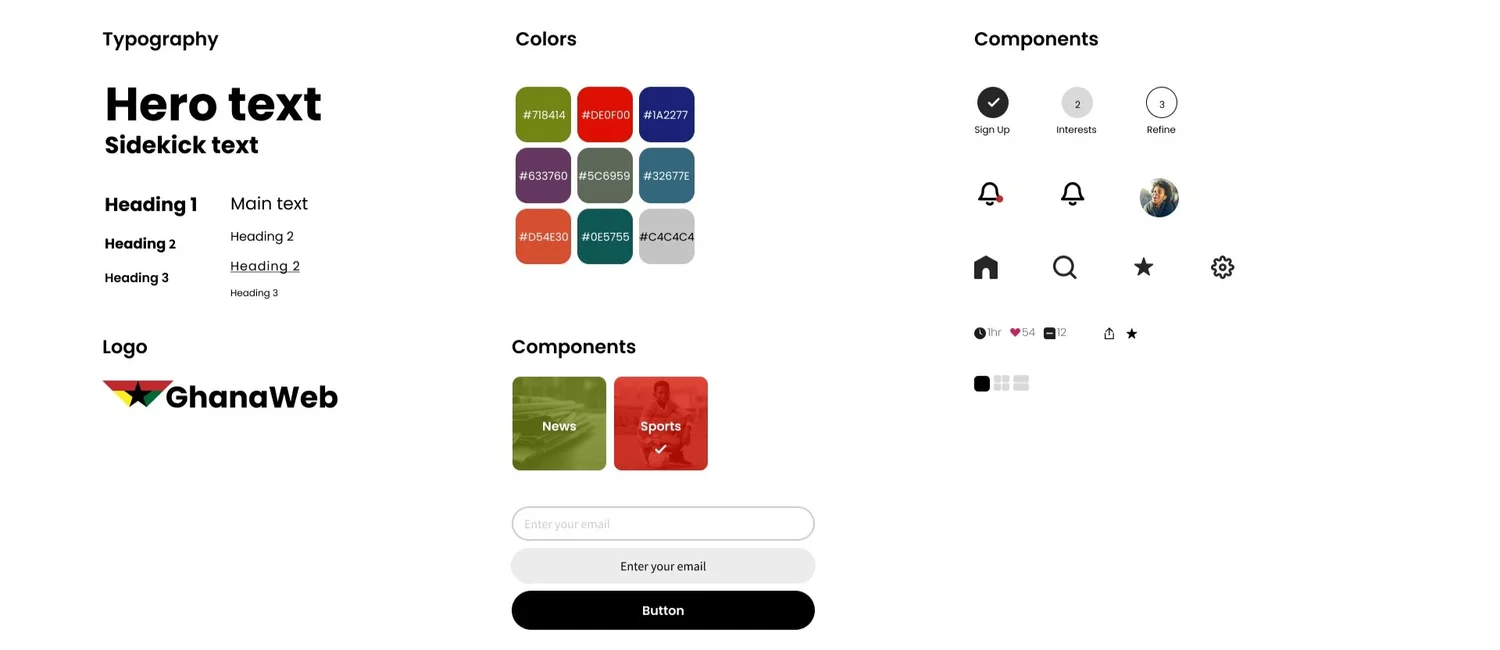
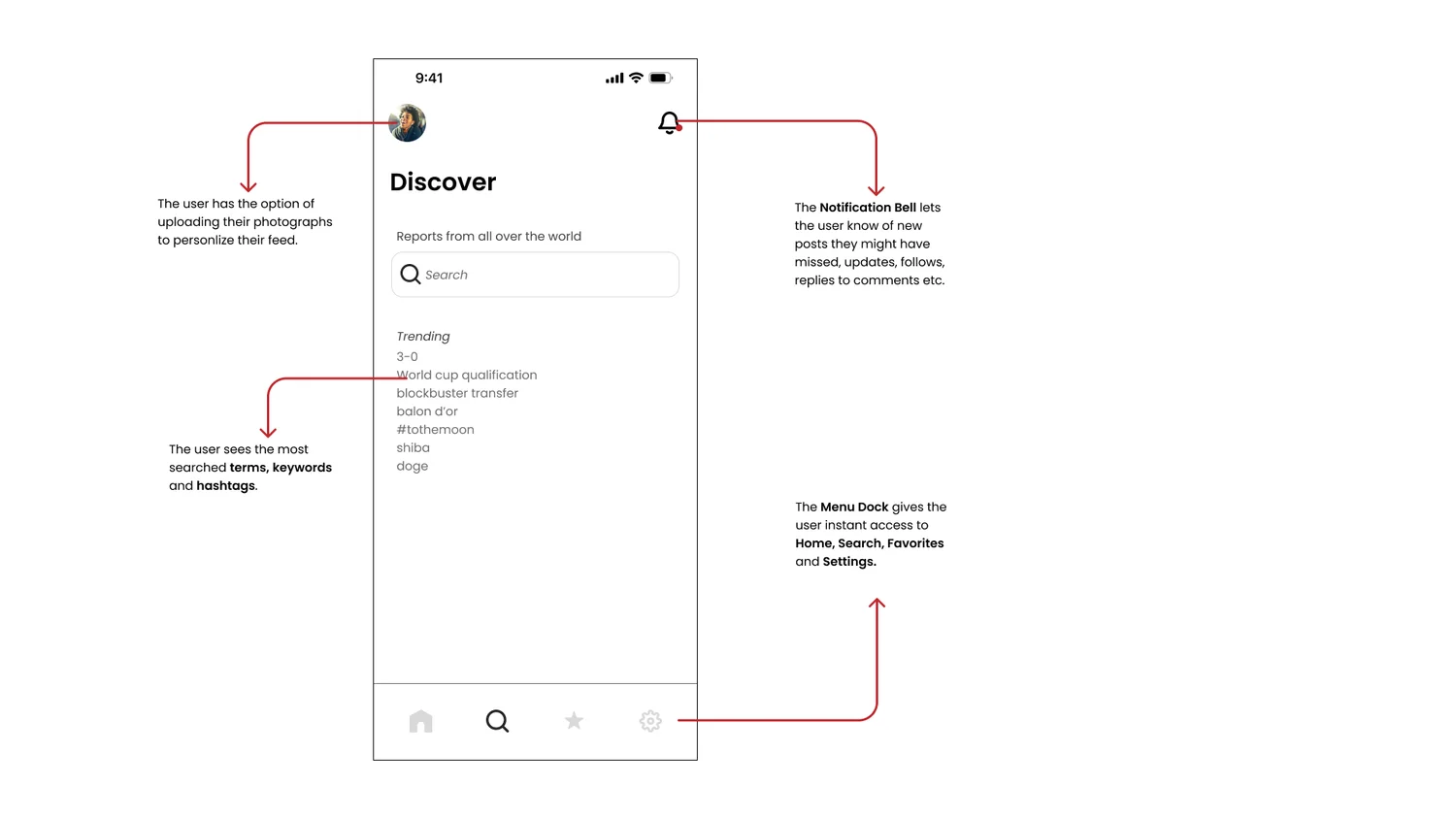
The style guide keeps GhanaWeb's own mark and color and adds a component set for category tiles, buttons and inputs. The annotated screens below are the ones that carry the three pain points: curation for the overload, a share sheet with large Instagram and Facebook targets for sharing, and the whole thing built mobile-first so there is no second URL.

Honest next steps.
- Test
- The curation flow is the whole product and it hasn't been tested with readers. The question to answer first: does a four-step onboarding cost more readers than an overloaded front page does?
- Measure
- How many readers finish curation versus take “Go straight to GhanaWeb”, and whether curated readers come back more often.
- Extend
- Let the feed learn from what people actually open, so curation is a starting point rather than a one-off setting.
As the sole designer and researcher I keep returning to this one — tuning the interface as feedback comes in and trying it on other platforms.