UX design and research · Mobile app
The best seat in the house has to exist on the map first.
A web app for reserving cinema seats without the scramble. Two rounds of usability testing reshaped it — most of all by surfacing who the first design had left out.
- Role
- UX designer and researcher — interviews, persona, storyboards, wireframes, prototype, usability studies
- Duration
- May – July 2022
- Platform
- Responsive web app, designed mobile-first
- Research
- Interviews, empathy maps, two usability rounds
- Tools
- Paper, Figma
A self-initiated project; “Movie Reservation App” is a working title. Theater names and posters in the mocks are illustrative.
Getting the seat you want is harder than it should be.
Frequent and casual moviegoers alike describe the same frustration: by the time you've picked the film, the showing and the theater, the seats you wanted are gone, and the app you used has forgotten everything about you by next week.
The goal: make reserving a seat simple and seamless — and make the app remember.
Sandra books for two.
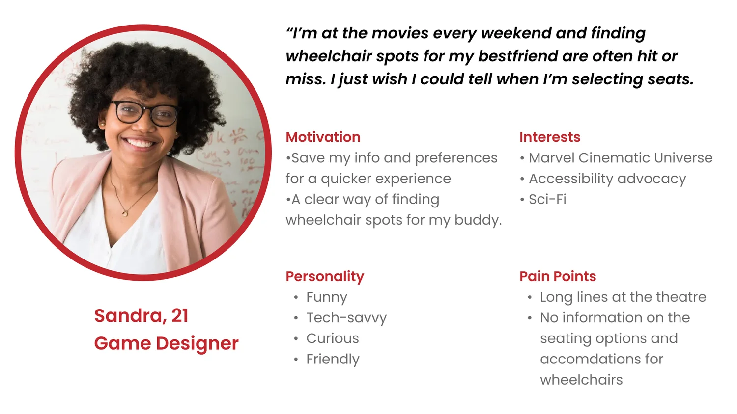
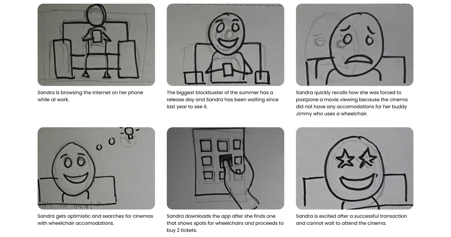
Interviews spanned teens to the elderly, but the person actually doing the booking was nearly always an adult. The persona is Sandra, 21, a game designer who goes to the movies most weekends — and whose best friend uses a wheelchair. “I just wish I could tell when I'm selecting seats.”
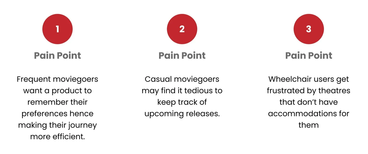
- Pain point 1
- Frequent moviegoers want the product to remember their preferences, so booking gets faster each time.
- Pain point 2
- Casual moviegoers find it tedious to keep track of upcoming releases.
- Pain point 3
- Wheelchair users are let down by theaters that don't show accommodations for them.
Two rounds, six findings, one omission.
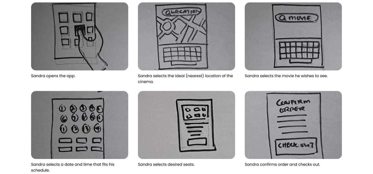
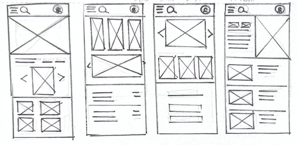
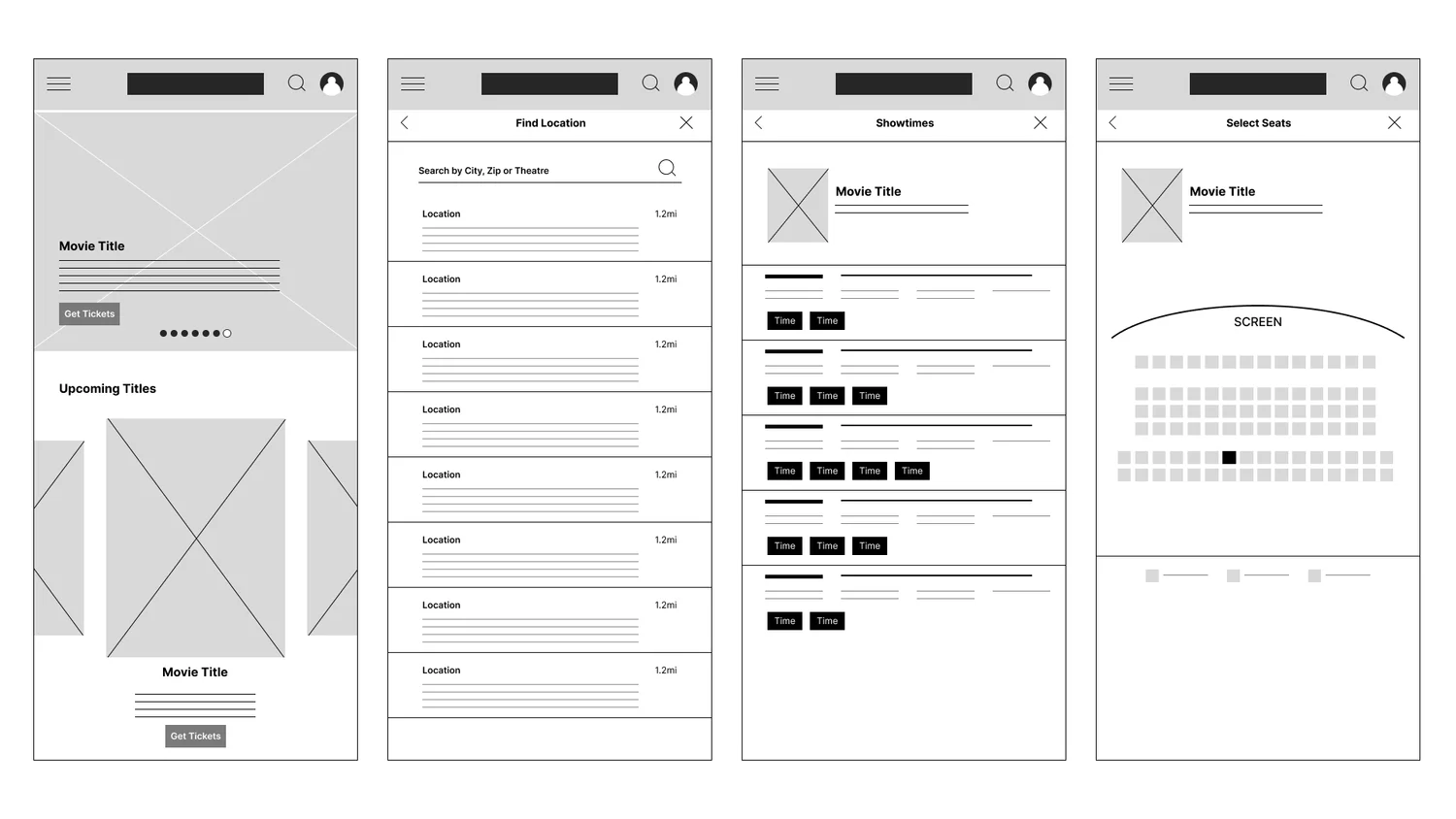
Paper wireframes first, so only the ideas that survived made it to digital wireframes, then a low-fidelity prototype for the first usability round, then a second round on the revised design.
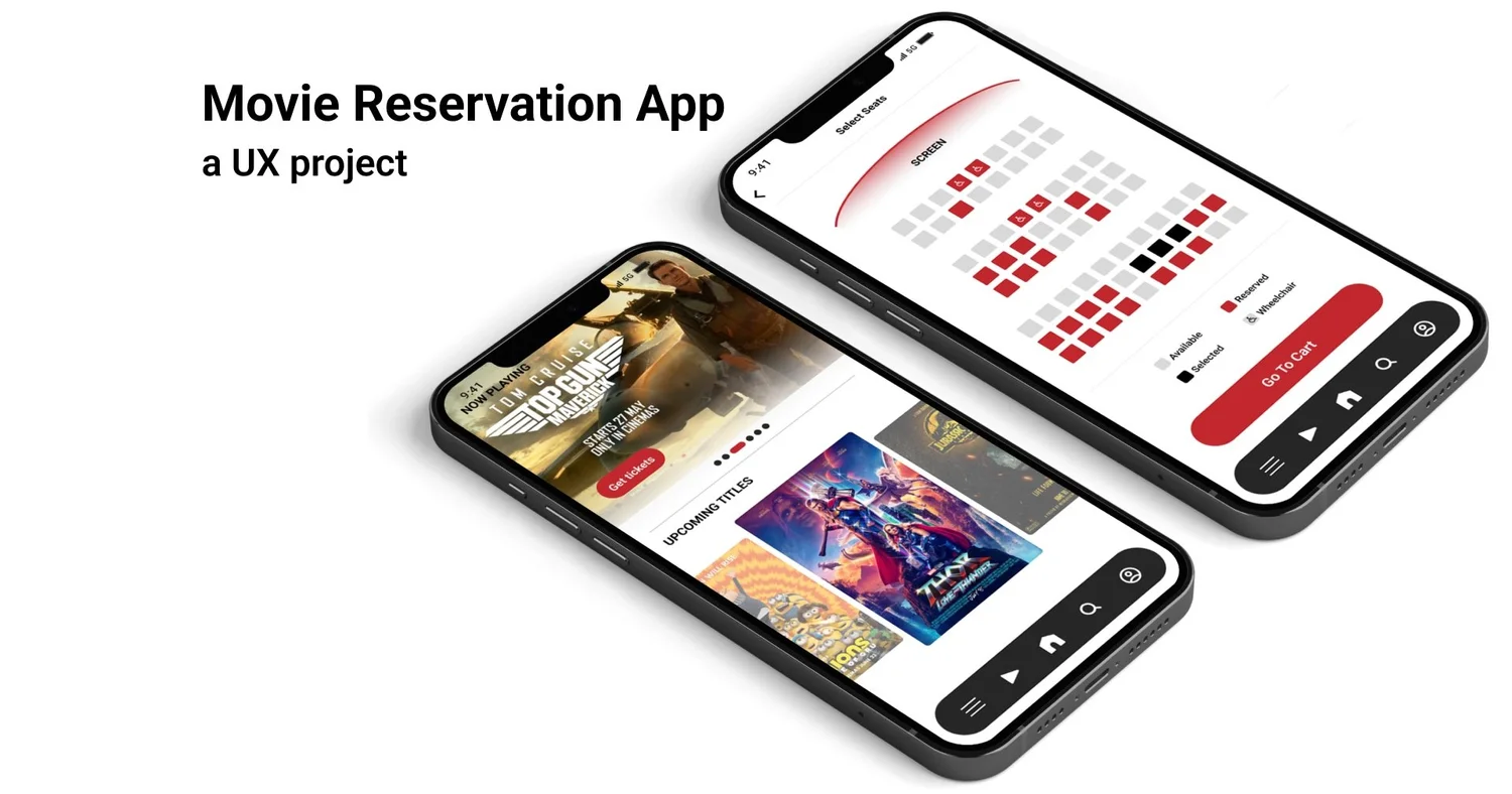
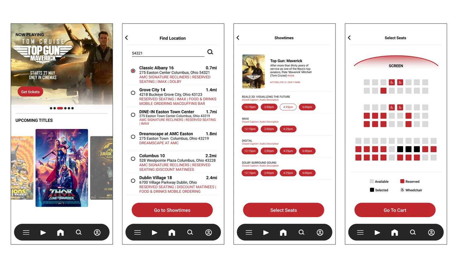
The early seat map showed position and availability. It did not show where a wheelchair could go — the exact thing Sandra's story was about. Testing caught it; the revised map has accessible seating marked, and it is the change I'd point to first.
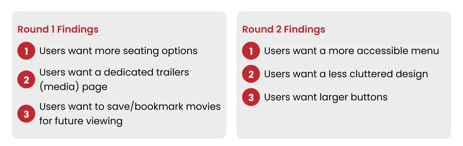
- Round 1
- Users wanted more seating options, a dedicated trailers page, and a way to save or bookmark films for later.
- Round 2
- Users wanted a more accessible menu, a less cluttered layout, and larger buttons.
What changed between the first mockups and the second.
- Wheelchair seating
- Added to the seat map, with its own legend entry next to available, reserved and selected.
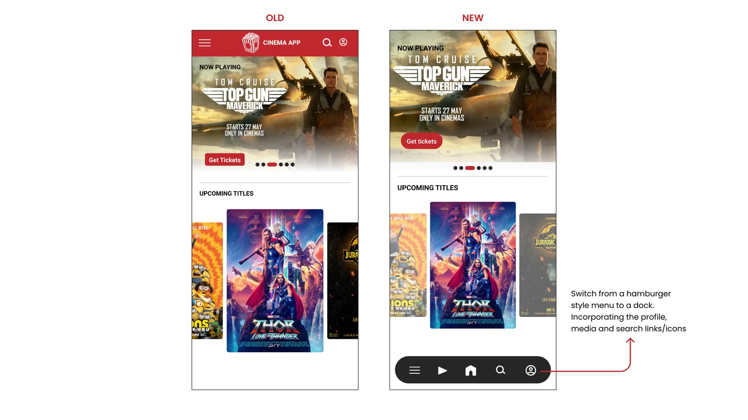
- Hamburger to dock
- The hidden menu became a bottom dock for profile, media, home and search — finding 1 of round 2, and the trailers page from round 1, in one move.
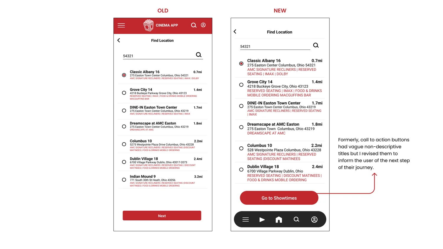
- Buttons that say where they go
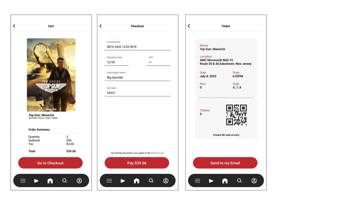
- Calls to action had vague, generic labels. They now name the next step — “Go to Showtimes”, “Select Seats”, “Go To Cart” — and they got bigger.
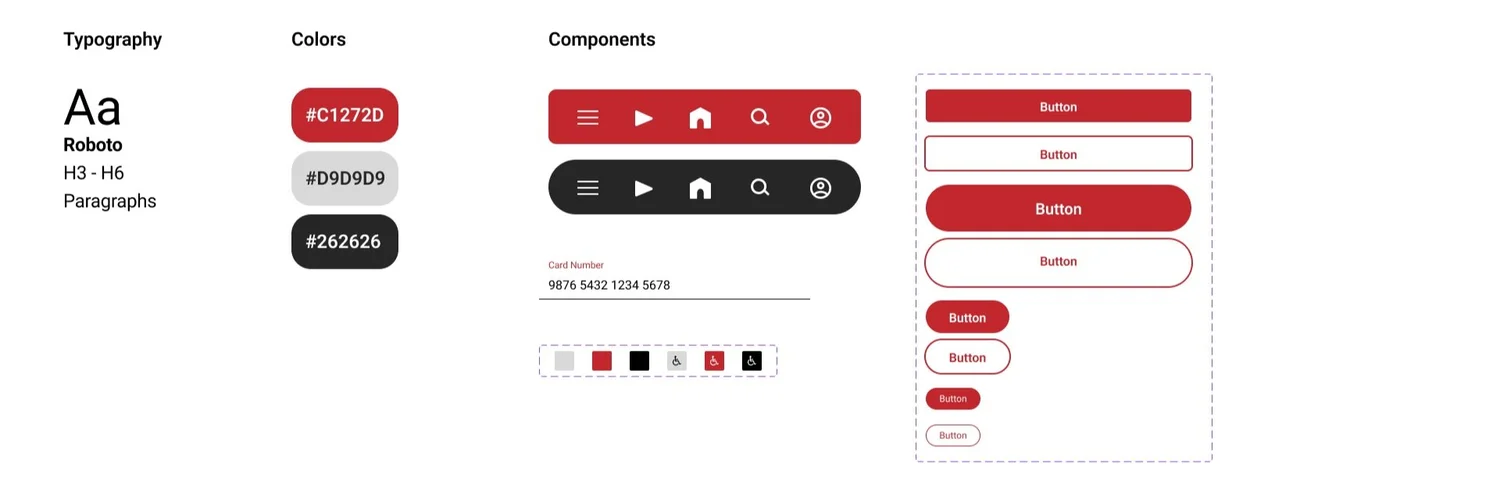
Built for the person the first draft missed.
- Screen readers
- Alt text on images, so the posters and seat map are described to people using assistive technology.
- Navigation
- Familiar icons with labels, in a high-contrast dock, so the menu is findable without guessing.
- Imagery
- Full posters and promotional material on the film pages, so people can judge a film the way they would in the lobby.
Honest next steps.
- Validate
- A third usability round on the final design, to confirm the pain points from research are actually resolved rather than assumed resolved.
- Research
- More interviews to find the needs this round didn't reach — the elderly users who showed up in research but rarely did the booking are the obvious gap.
- Remember
- Pain point one — remembering preferences — is the least resolved. Saved theaters and seat preferences are the next feature.
What I took from it: the first idea is only the start. Usability studies and peer feedback changed every iteration, and the most important change was one I hadn't seen coming.